
Most enterprise product teams do not have a consistency problem because their designers lack talent. They have one because ten squads keep rebuilding the same button, the same date picker, and the same modal in slightly different ways. A design system fixes that at the root. As an experienced UI/UX and product engineering partner, KKRF Group builds design systems that turn scattered UI decisions into a single, governed source of truth your designers and engineers actually reuse.
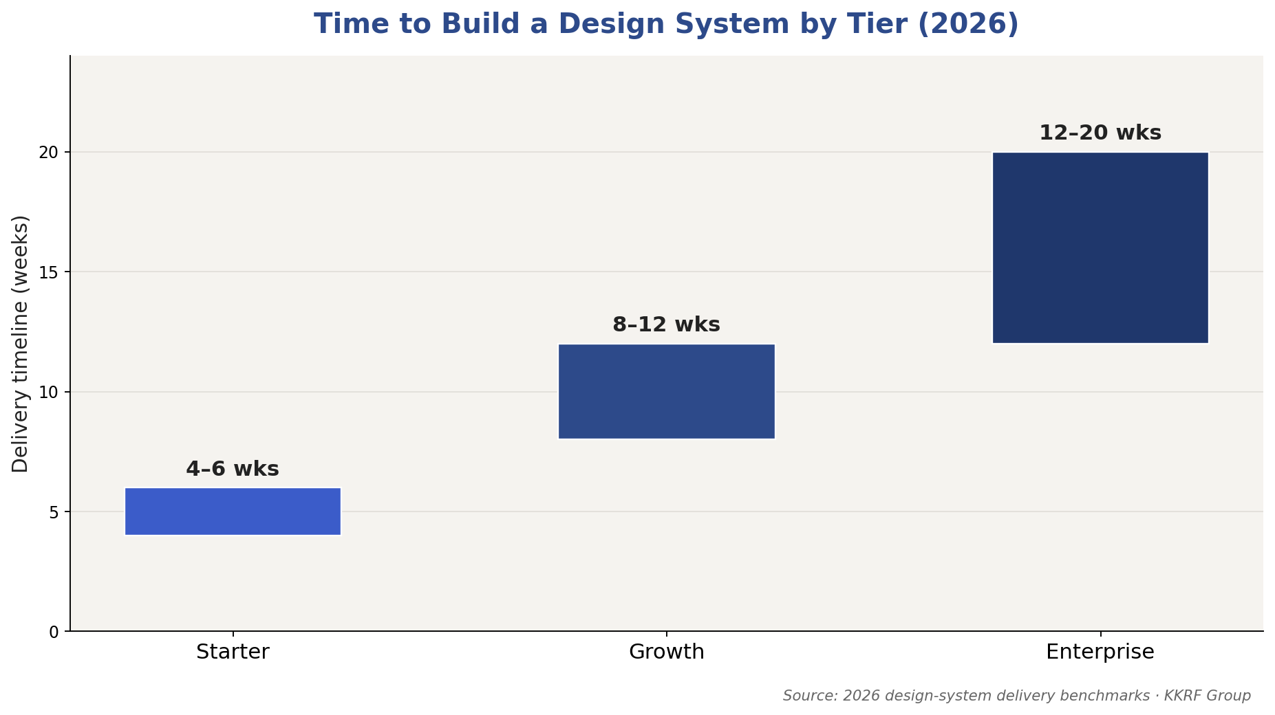
Quick answer: Design system development services build and maintain a shared library of design tokens, reusable UI components, usage guidelines, and documentation so every team ships a consistent, accessible product faster. In 2026, a starter system runs $5,000–$10,000, a growth-stage system $10,000–$25,000, and a multi-brand enterprise system $25,000–$60,000+, delivered over 4 to 20 weeks depending on component count, code integration, and governance scope.
Key Takeaways
- A design system is more than a component library — it pairs reusable UI components with design tokens, patterns, and governance rules that define how decisions get made.
- Design system development cost in 2026 ranges from $5,000 for a starter library to $60,000+ for a governed, multi-brand enterprise system.
- Design tokens are the backbone: they let one color or spacing change propagate across web, iOS, and Android without manual edits.
- Governance and adoption — not the initial build — decide whether a design system survives past its first year.
- A well-adopted system can lift component-level task completion speed by roughly a third and return well over 100% ROI within a few years.
- Build a design system when you run multiple products or platforms; hold off when you have one small app that rarely changes.
- KKRF Group delivers token architecture, coded component libraries, Storybook documentation, and a governance model built for long-term reuse.
On this page
- What Is a Design System?
- Design System vs. Component Library vs. Style Guide
- What Design System Services Include
- How Much It Costs in 2026
- The Development Process, Step by Step
- Design System Tech Stack and Tools
- Governance and Adoption
- The ROI and Business Case
- Common Mistakes to Avoid
- Decision Framework: When to Build
- How to Choose a Partner
- Frequently Asked Questions
What Is a Design System? A Clear Definition
Think of it as the difference between owning a pile of LEGO bricks and owning the instruction booklet, the sorted trays, and the rule that everyone builds from the same set. The components are the visible part. The real value sits in the shared language underneath: named tokens for color and spacing, documented patterns for common flows, and a clear process for proposing changes.
Mature systems like IBM Carbon, Shopify Polaris, and Google Material Design prove the model at scale. Each one lets hundreds of contributors ship interfaces that feel like one product because they draw from the same tokens and components. A design system development service brings that same discipline to your organization, sized to your product portfolio rather than a trillion-dollar platform.
Design System vs. Component Library vs. Style Guide
These three terms get used interchangeably, and that confusion causes teams to buy the wrong thing. Each one is a different scope, and a design system is the largest of the three.
| Aspect | Style Guide | Component Library | Design System |
|---|---|---|---|
| Primary output | Brand and visual rules | Reusable coded/design UI elements | Tokens + components + patterns + governance |
| Includes working code | Rarely | Yes | Yes, plus design-side parity |
| Covers usage rules | Visual only | Limited | Full: when, why, and how |
| Single source of truth | No | Partial | Yes |
| Best for | Small brand consistency needs | One product’s UI reuse | Multiple products, teams, or platforms |
What Design System Development Services Include
A credible design system development company delivers far more than a Figma file. The engagement covers design, code, documentation, and the operating model that keeps everything in sync. Here is what a complete service typically includes.
- UI audit and inventory: a full catalogue of existing screens and components to expose duplicates, inconsistencies, and gaps before anything new is built.
- Design token architecture: primitive, semantic, and component-level tokens for color, typography, spacing, and interaction that drive consistency across platforms.
- Component library: production-ready UI components built in both the design tool (Figma) and code (React, Vue, or Web Components) with matching behavior.
- Pattern library: documented solutions for recurring flows like forms, empty states, navigation, and error handling.
- Storybook documentation: a living, browsable reference where engineers see every component, its props, and its states.
- Accessibility compliance: components tested against WCAG 2.2 so accessibility is built in, not bolted on later.
- Design-development handoff: structured DevMode pipelines and contribution rules that keep design and engineering aligned.
- Governance model: versioning, contribution workflows, review gates, and an ownership structure for the long term.
We have seen this go wrong when a team treats the component library as the finish line. Without governance and documentation, that library quietly drifts out of date within months, and squads go back to copy-pasting. The operating model is what makes design system development services pay off.
How Much Does Design System Development Cost in 2026?
Design system development cost in 2026 depends on three things: how many components you need, whether you want coded components or design-only assets, and how much governance and documentation the system carries. The ranges below reflect current agency and specialist pricing.
| Tier | Scope | Typical cost | Timeline |
|---|---|---|---|
| Starter | 30–50 components, basic token architecture, Figma library setup | $5,000–$10,000 | 4–6 weeks |
| Growth | 60–100 components, full token architecture, interaction docs, accessibility review, developer handoff | $10,000–$25,000 | 8–12 weeks |
| Enterprise | 100+ components, multi-brand support, full code integration, Storybook, governance framework, team training | $25,000–$60,000+ | 12–20 weeks |
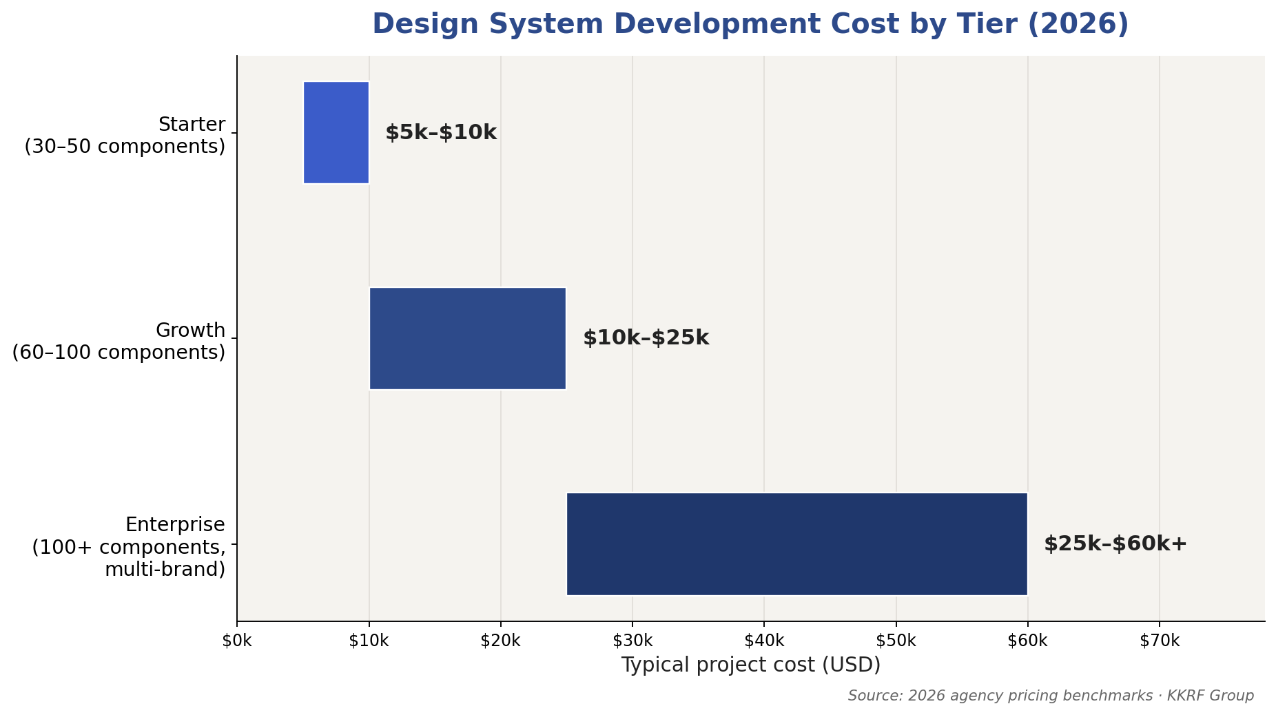
Two factors push cost toward the top of these ranges. The first is code integration: building components in React or Web Components and wiring them to tokens costs more than delivering a design-only Figma library. The second is multi-platform parity — a system that must stay identical across web, iOS, and Android carries more engineering and testing than a single-platform library.
There is also a recurring cost most buyers forget. A design system is a product, not a project, so budget for ongoing maintenance — typically 15% to 25% of the initial build per year — to cover new components, framework upgrades, and support. KKRF Group scopes both the build and the maintenance model up front so the number does not surprise you in year two.
Not sure which tier fits your product portfolio? We will map your current UI, estimate component count, and give you a fixed-scope build and maintenance plan. Talk to our design systems team for a straight answer.
Get a Custom Project Estimate →The Design System Development Process, Step by Step
A reliable design system development process moves from audit to architecture to build to governance. Skipping the early steps is the most common reason systems fail to get adopted. Here is the sequence we follow.
Step 1: Audit and UI inventory
Before building anything new, catalogue every existing UI element across your products. This exposes how many button variants, form styles, and color values are actually in use — often dozens more than teams expect. The audit defines the true scope and gives you a baseline to measure consistency against.
Step 2: Define design token architecture
Design tokens are named values for color, typography, spacing, and interaction. Structure them in three layers: primitive tokens hold raw values, semantic tokens describe usage in context, and component tokens reference the semantic layer. This structure is what lets a single brand-color change ripple across every platform without manual edits.
Step 3: Build the core component library
Design and engineer the foundational components — buttons, inputs, selects, modals, navigation — with matching behavior in Figma and in code. Each component is built to support multiple products from day one, with variants and states documented rather than duplicated.
Step 4: Document in Storybook
Publish a living documentation site, usually Storybook, where every component appears with its props, states, accessibility notes, and usage guidance. Documentation is not an afterthought — a component nobody can find or understand will not be reused.
Step 5: Bake in accessibility
Test each component against WCAG 2.2 for contrast, keyboard navigation, focus states, and screen-reader support. Building accessibility into the shared components means every product that adopts the system inherits compliance instead of fixing it one screen at a time.
Step 6: Establish governance and contribution rules
Decide who owns the system, how teams propose new components, and how changes are reviewed and versioned. A clear contribution model turns the system from a one-time deliverable into something the whole organization maintains together.
Step 7: Roll out, train, and drive adoption
Migrate products onto the system, train designers and engineers, and track adoption metrics. Adoption is the real finish line: a system used by two of ten teams is a cost, while one used by all ten is a compounding asset.
Design System Tech Stack and Tools
The right tooling keeps design and code in sync automatically. Most modern design systems draw from a small, well-established stack rather than exotic tooling.
| Layer | Common tools | Purpose |
|---|---|---|
| Design | Figma (libraries, variables) | Source of truth for designers; token variables |
| Tokens | Style Dictionary, W3C Design Tokens format | Transform tokens into platform-specific code |
| Components | React, Vue, Web Components, Tailwind | Production UI code shared across products |
| Documentation | Storybook, zeroheight | Living reference and usage guidance |
| Quality | Chromatic, axe, Playwright | Visual regression and accessibility testing |
The most important choice here is a token pipeline. Tools like Style Dictionary compile one set of design tokens into CSS variables, iOS assets, and Android resources at once, which is exactly what keeps a multi-platform enterprise design system from drifting. As a product engineering partner, we standardize on the emerging W3C Design Tokens format so your system is not locked to a single vendor.
Design System Governance and Adoption
Governance is the discipline that keeps a design system alive after launch. It answers three questions: who owns the system, how do teams contribute, and how are changes reviewed and released. Without answers, even a beautifully built system rots as products evolve around it.
Three governance models are common. A centralized model puts one dedicated team in charge of everything, which keeps quality high but can bottleneck delivery. A federated model lets contributors from product teams add to the system under review, balancing speed and control. A hybrid model keeps a small core team owning foundations while distributed contributors extend the edges. Most enterprises land on federated or hybrid as they scale.
Adoption is measured, not assumed. Track the share of product screens built from system components, the number of off-system one-off components created each sprint, and time saved per feature. When adoption stalls, the cause is almost always friction — poor documentation, missing components, or an unclear contribution path — not unwilling teams.
The ROI and Business Case for a Design System
A design system earns its budget by removing repeated work. When a checkout flow, a data table, and a settings page all pull from the same governed components, teams stop rebuilding and start assembling. That shows up as faster delivery, fewer bugs, and a more consistent product.
The numbers back it up. Reusable component libraries have been shown to improve task completion speed by around 34%, and organizations running mature design systems report returns exceeding 100% within a few years of adoption. The gains compound: every new product that launches on the system inherits accessibility, consistency, and speed for free.
There is a quality dividend too. Because accessibility and interaction behavior live in shared components, fixing an issue once fixes it everywhere. For regulated industries — fintech, healthcare, SaaS handling sensitive data — that centralized control over accessibility and consistency is a compliance advantage, not just a design nicety.
Common Design System Mistakes to Avoid
Most failed design systems share the same handful of mistakes. Knowing them upfront is the cheapest insurance you can buy.
- Building components before auditing: without an inventory, you standardize the wrong things and miss the real inconsistencies.
- Skipping token architecture: hard-coded values instead of tokens means every rebrand or platform becomes a manual slog.
- Treating it as a one-time project: a design system with no maintenance budget or owner is dead within a year.
- Ignoring engineering: a system designed only in Figma, with no coded parity, forces developers to reinvent everything anyway.
- Over-building early: shipping 200 components nobody asked for wastes budget; start with the components products actually use.
- No adoption plan: a system that teams are not trained on or incentivized to use quietly gets bypassed.
Decision Framework: When to Build a Design System (and When Not To)
A design system is a serious investment, and it is not right for every team. Use this framework to decide honestly.
Build a design system when:
- You run two or more products, or one product across web, iOS, and Android.
- Multiple designers and engineering squads keep rebuilding the same UI.
- Brand or accessibility consistency is a business requirement, not a nice-to-have.
- You are scaling the team and onboarding speed matters.
Hold off when:
- You have one small product that rarely changes.
- Your team is fewer than a handful of people sharing one Figma file.
- You are still validating the product and the UI is deliberately in flux.
Limitations to accept: a design system adds process overhead and needs ongoing funding. It slows the first few features before it speeds up the next hundred. Our recommendation: if you check two or more “build” signals, start with a focused growth-tier system and expand as adoption proves out — do not begin with a 200-component enterprise build you cannot yet maintain.
A short discovery call is usually enough to tell whether you need a full system or a focused component library first. See how our UI/UX design services work, then let us pressure-test your case.
Book a Discovery Call →How to Choose a Design System Development Partner
The right partner has shipped design systems that teams actually adopted — not just pretty Figma files. When you evaluate a design system agency or development company, weigh these criteria.
| Criterion | What to look for | Why it matters |
|---|---|---|
| Design + engineering under one roof | Token pipeline and coded components, not design-only | Design-only systems get reinvented by developers |
| Token architecture experience | Primitive/semantic/component token structure | Determines multi-platform scalability |
| Governance track record | Contribution models and adoption metrics | Governance decides whether the system survives |
| Accessibility depth | WCAG 2.2 testing built into components | Compliance inherited, not retrofitted |
| Documentation quality | Storybook and clear usage guidance | Undocumented systems do not get adopted |
KKRF Group brings design and engineering together as one team, which is the single biggest predictor of a design system that survives contact with real product deadlines. We build token architecture on open standards, ship coded component libraries with Storybook documentation, and hand you a governance model your teams can run. As a long-term technology partner, we also support the system after launch, when most of the value is either captured or lost. For teams weighing a broader modernization effort, our product engineering services and engagement models extend the same discipline across the full stack.
Frequently Asked Questions
What is a design system in simple terms?
A design system is a shared, governed library of reusable UI components, design tokens, and usage rules that lets every team build a consistent, accessible product from the same source of truth. It combines the visual building blocks with the documentation and governance that keep them consistent everywhere.
How much does design system development cost in 2026?
A starter design system costs about $5,000 to $10,000, a growth-stage system $10,000 to $25,000, and a multi-brand enterprise system $25,000 to $60,000 or more. Code integration and multi-platform parity are the biggest cost drivers, and ongoing maintenance typically adds 15 to 25 percent of the build cost per year.
What is the difference between a design system and a component library?
A component library is a collection of reusable UI elements, while a design system is the larger framework that adds design tokens, usage patterns, documentation, and governance around those components. A component library is one part of a design system, not the whole thing.
How long does it take to build a design system?
A starter system takes about 4 to 6 weeks, a growth-stage system 8 to 12 weeks, and an enterprise system with full code integration and governance 12 to 20 weeks. The timeline scales with component count, platform parity, and how much documentation and training is included.
What are design tokens?
Design tokens are named values for color, typography, spacing, and interaction that act as the single source of truth for visual style. Structured in primitive, semantic, and component layers, they let one change propagate across web, iOS, and Android without manual edits.
Is a design system worth it for a small team?
For a single small product that rarely changes, a full design system is usually overkill and a simple component library is enough. A design system pays off once you run multiple products or platforms, have several designers and engineers, or need enforced brand and accessibility consistency.
Ready to turn scattered UI into one governed, scalable system? KKRF Group designs, builds, and maintains enterprise design systems your teams will actually adopt. Start with a technical assessment of your current UI.
Request a Technical Assessment →